Zako's Tacos
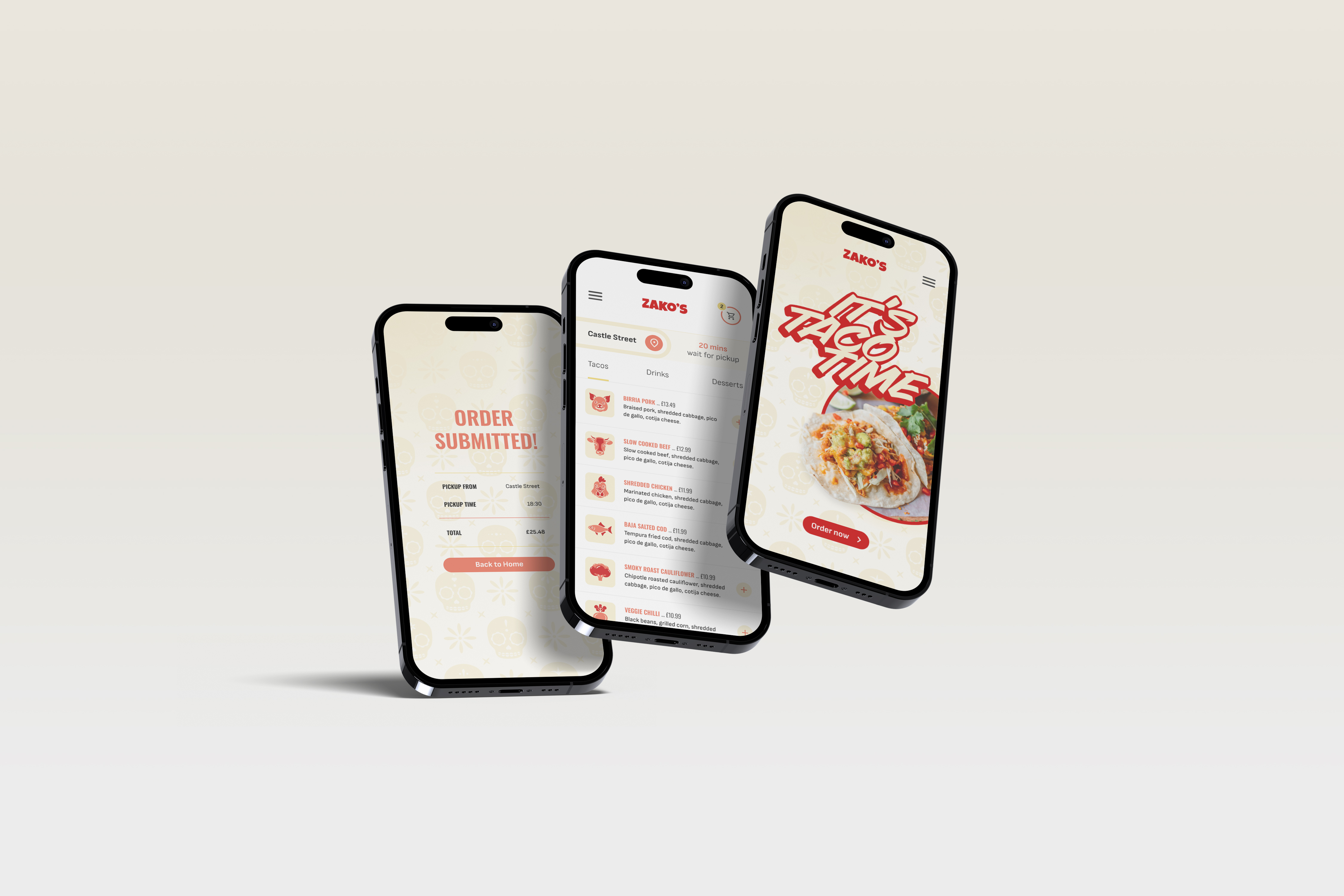
A mobile ordering app designed to reduce friction, save time, and remove the stress of ordering at a busy food truck. From research through to tested prototype.
User pain points
The research phase focused on understanding real frustrations with food ordering, not just what people do, but how it makes them feel. Interviews were devised around these research goals to ask the target audience: 16-35, metropolitan and suburban, with varying comfort levels around technology and language. The following pain points were identified.
01
Too many decisions
Users in a rush or in a busy environment felt overwhelmed by choice at the point of ordering – leading to stress and slower decisions.
02
Unclear menus
Non-English speakers and first-time visitors struggled with handwritten or complex menus – a barrier that affected confidence and experience.
03
Queues
Waiting in line added friction and stress to what should be a quick and enjoyable experience – particularly during busy periods.
04
Inconsistent hours
Food truck opening hours were often hard to find and unreliable – leading to wasted journeys and frustration.
User persona and journey
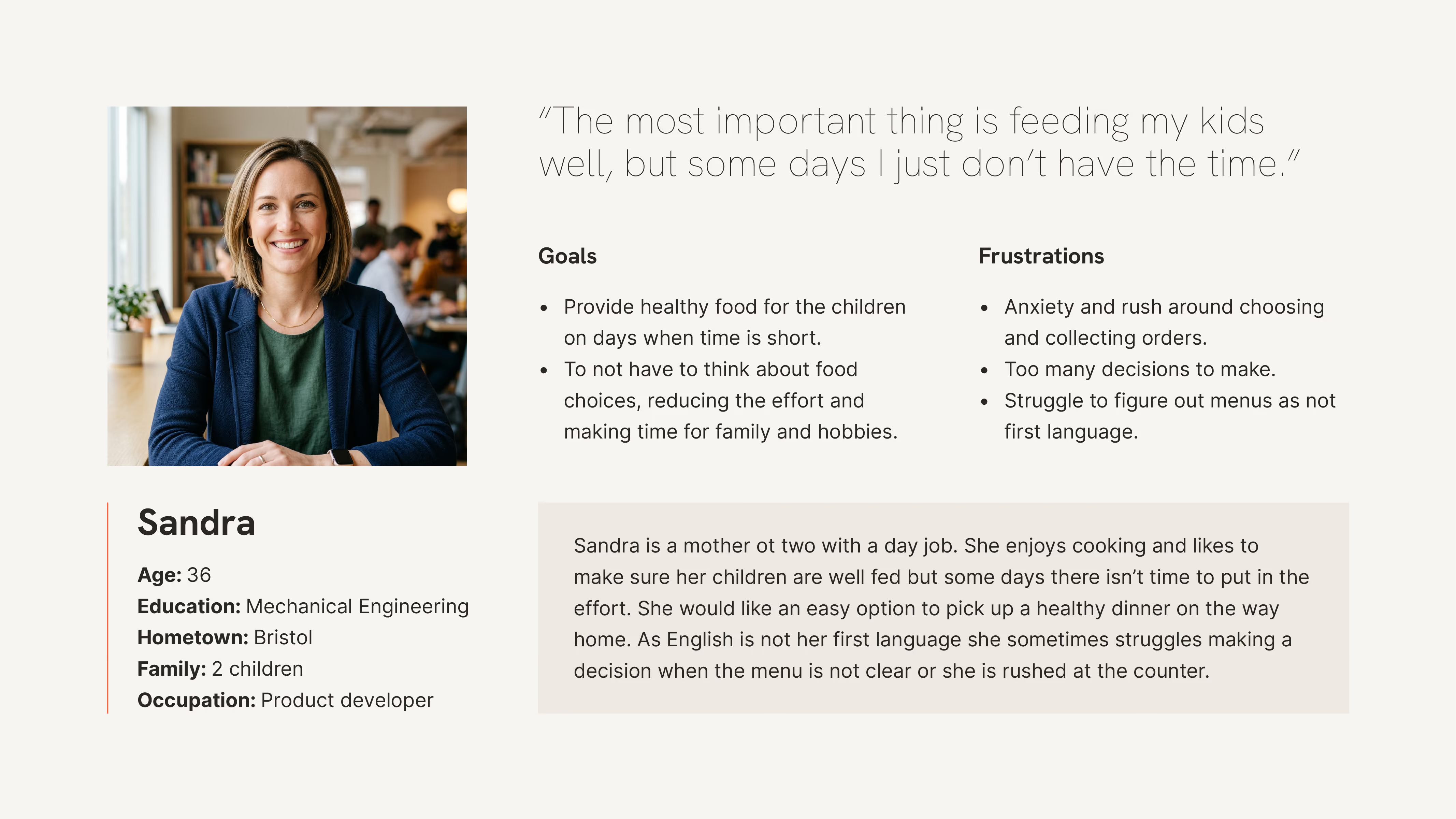
With the research so far, I created a user persona to ground the project in a real human need, giving the design a clear focus and a person to design for.
Problem statement:
Sandra is a mother of two with a day job who needs an up to date menu and ordering app for her local taco truck restaurant because it is difficult to decide and remember what her children want in a busy environment.
Leave work and pick up children
Task list
- Leave work
- Get children packed into the car
- Ask them what they want to eat
Emotions
Relief at the end of the work day.
Uncertainty over choices and stress over indecision.
Uncertainty over choices and stress over indecision.
Improvement opportunities
Create an app where they can browse an up to date menu of their favourite food places.
drive to food outlet
Task list
- Find a parking spot
- Walk over to shop
- Wait in line
Emotions
Stress finding a spot.
Improvement opportunities
App can advise when to go to a drive through pick up.
place an order
Task list
- Look over menu and decide
- Place order with cashier
- Pay for order
Emotions
Anxious about picking what to order that the children will be happy with.
Improvement opportunities
Easy to view menu with choices in app.
collect order
Task list
- Collect and extras / sauces etc.
- Find a spot to wait
- Listen out for order
Emotions
Frustration about having to wait.
Improvement opportunities
Order ahead and know exactly when the order is ready to collect.
drive home
Task list
- Pick up the order
- Take it back to the car
- Drive home to eat
Emotions
Relief of getting food.
Improvement opportunities
Mapping Sandra's user journey showed that it would be useful to have an app to order to avoid stress and anxiety during the process. This could be particularly helpful for those with language and communication difficulties.
Value Proposition
The taco truck ordering app allows users to order ahead and track their order. This avoids tough decisions at the checkout and saves them time.
User flow and storyboards
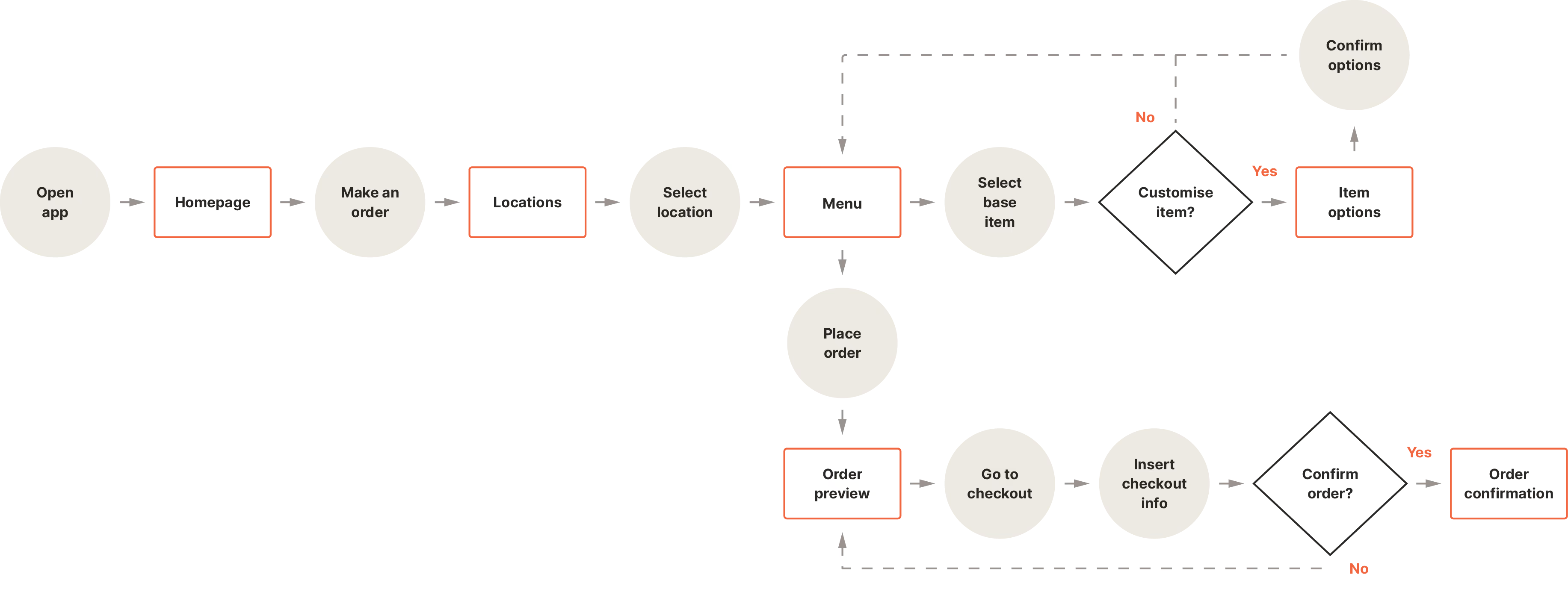
Mapping Sandra's journey through the existing ordering experience revealed where stress and friction peaked and made clear that a mobile ordering solution would be most valuable before she even arrived at the truck.
Competitive audit report
Comparing the online ordering experience for a selection of direct and indirect competitors led to the discovery of some gaps in their approach and therefore a set of opportunities for the product:
- Simple ordering by default, with customisation available for those who want it.
- Taco-focused menu with clear options, avoiding unnecessary complexity.
- Streamlined flow to get customers ordering quickly.
- Ingredient and allergen detail available on demand, not in the way.
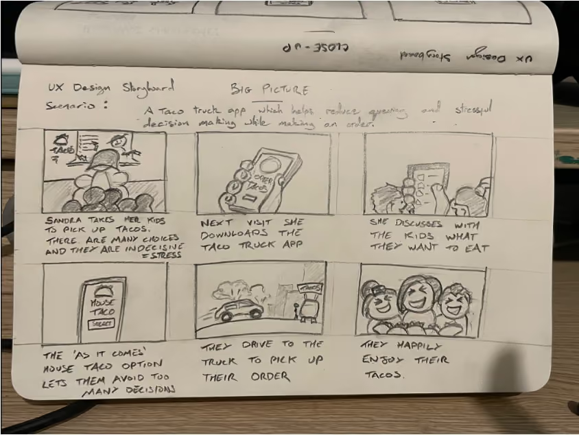
Storyboard – Big picture
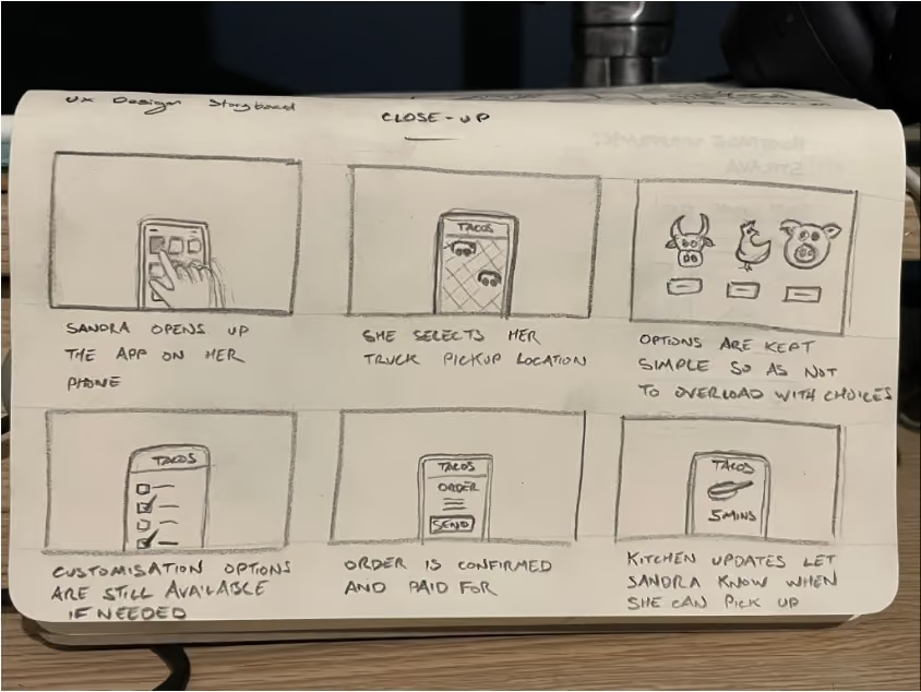
Storyboard – Close-up
prototype
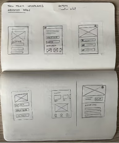
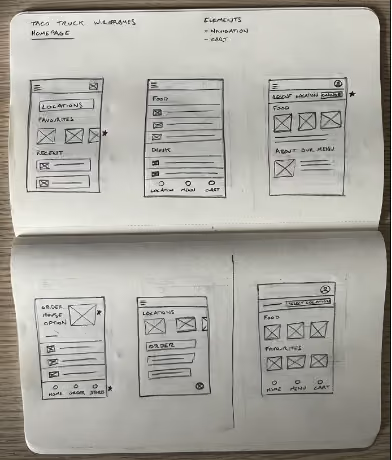
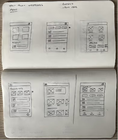
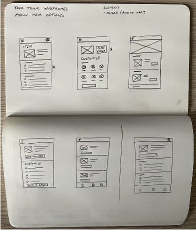
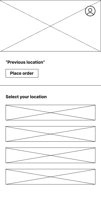
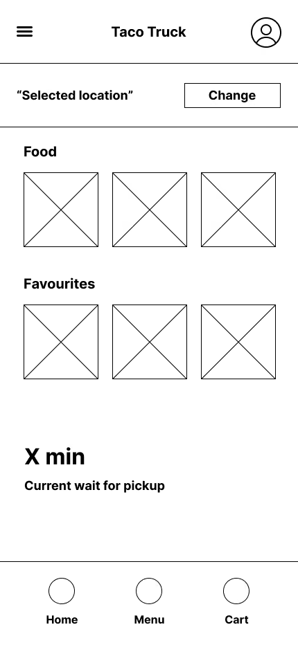
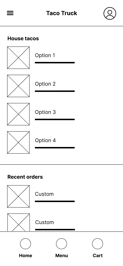
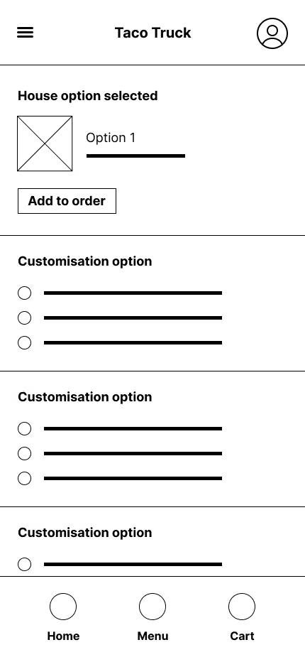
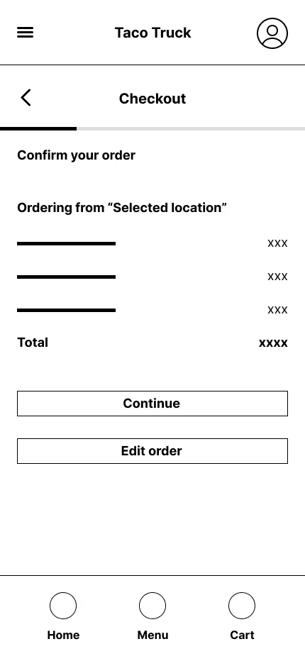
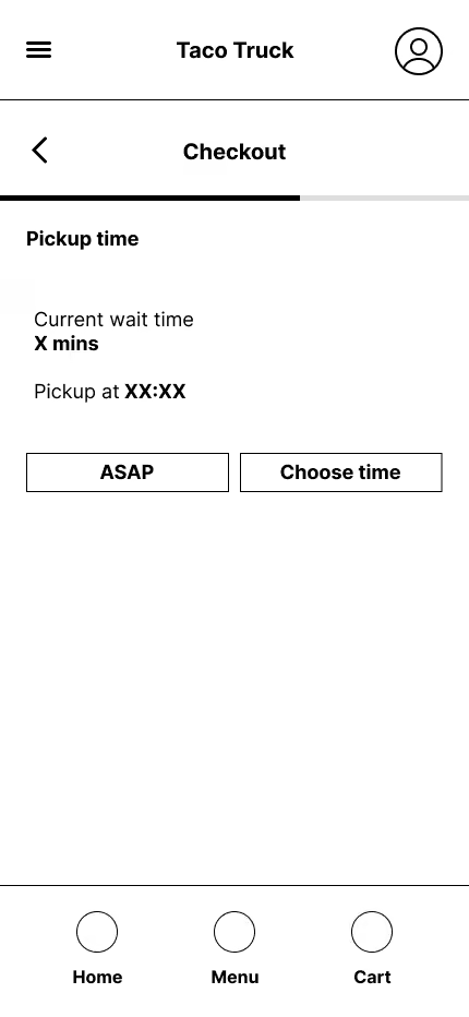
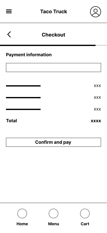
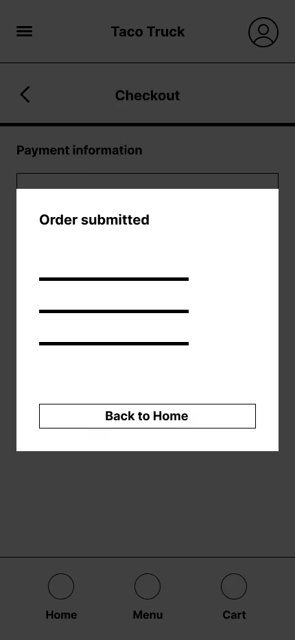
Layouts were explored on paper before refining and digitising a full set of wireframes and setting up a lo-fi prototype.
insights
A usability study was conducted with participants completing a set of tasks on the lo-fi prototype. Three key insights emerged, each leading to a clear design change.
01
Confirmation pop-up couldn't be dismissed
Users instinctively clicked outside the pop-up to close it – but this had no effect, creating confusion about whether the action had been completed
Use a full-screen modal
02
"ASAP" implied a price premium
The ASAP time option caused users to hesitate. Several assumed it meant paying extra, rather than simply choosing the earliest available slot.
Clearer time labels
03
Location button was misunderstood
Users tapped the location name text rather than the dedicated button, suggesting the visual hierarchy between label and action wasn't clear enough.
Rethink location UI
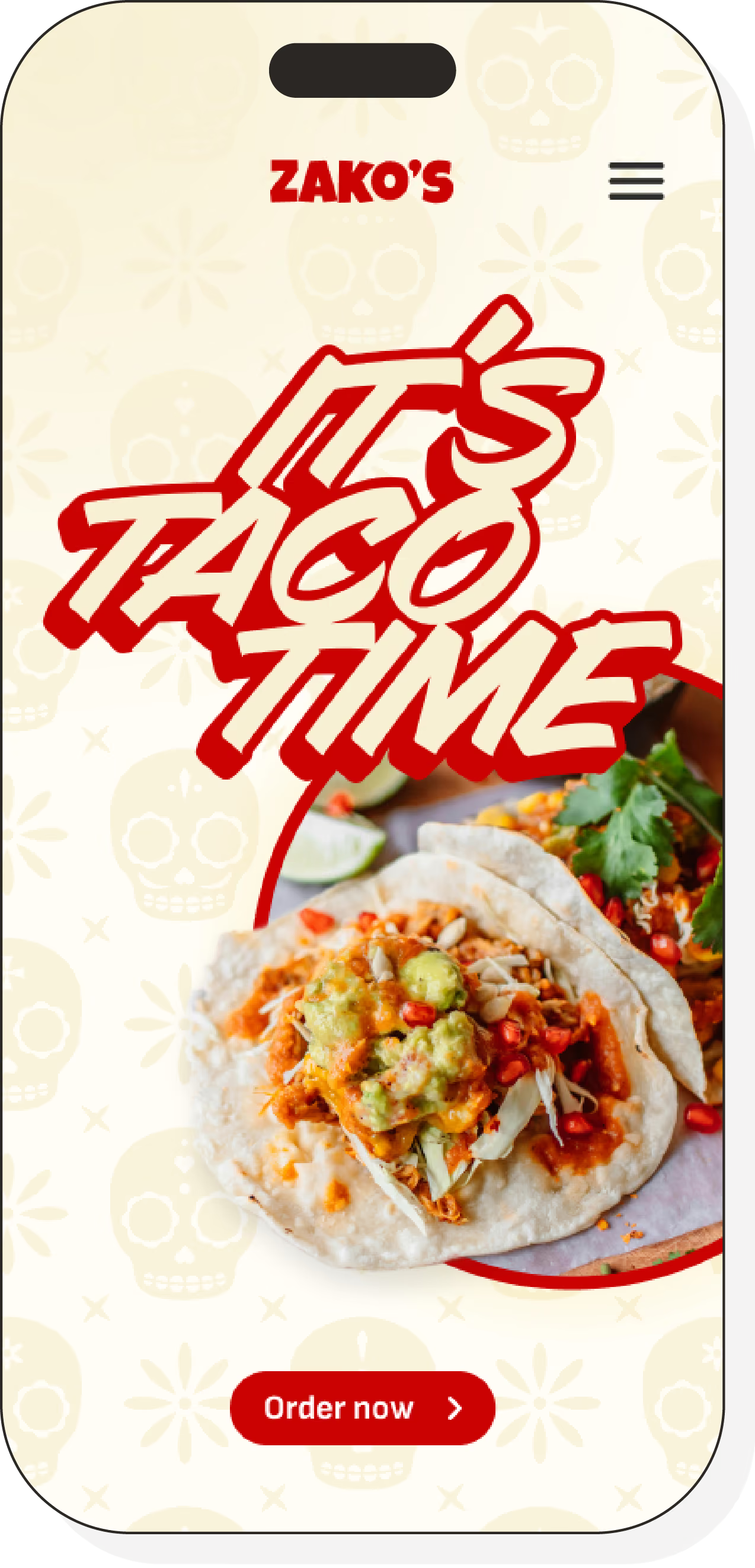
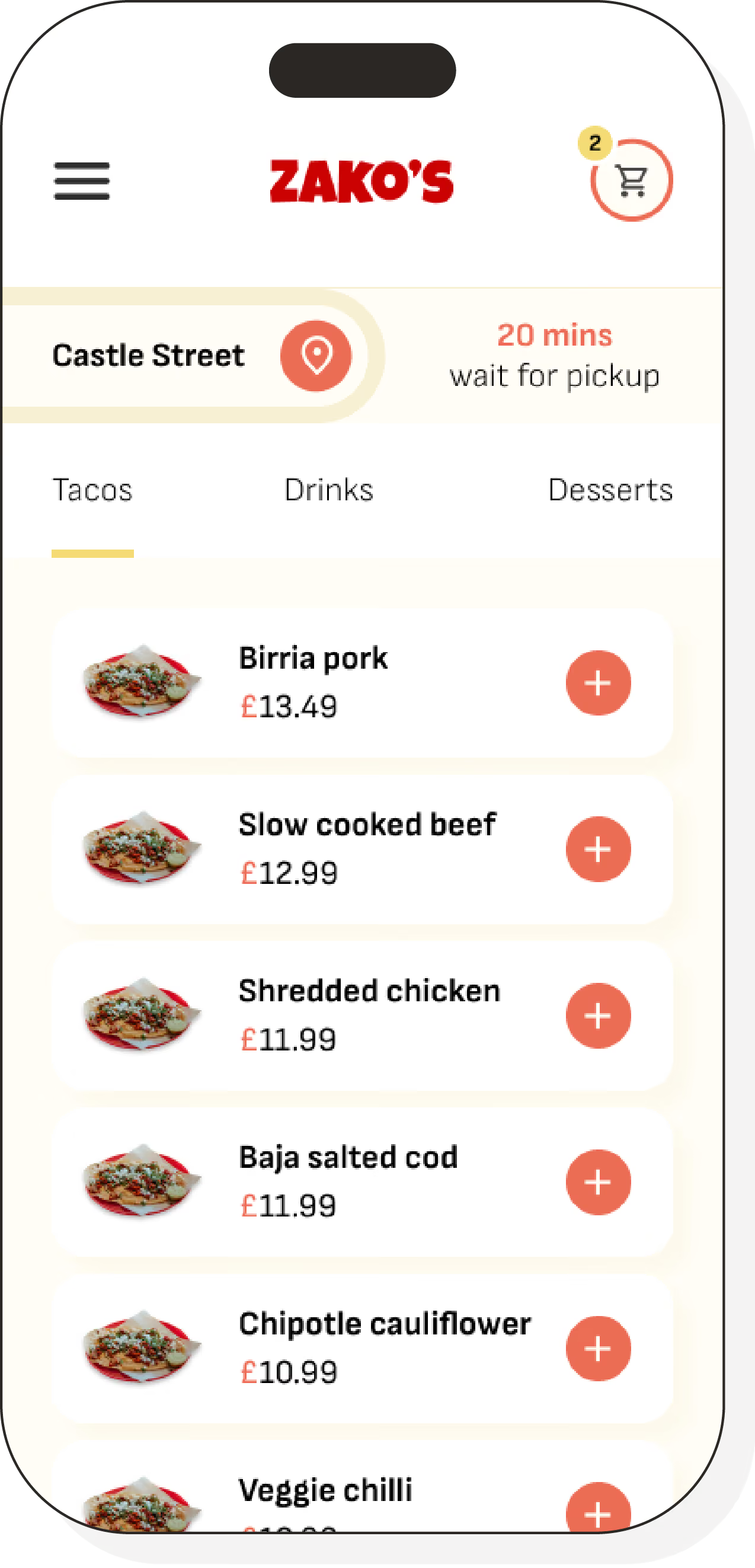
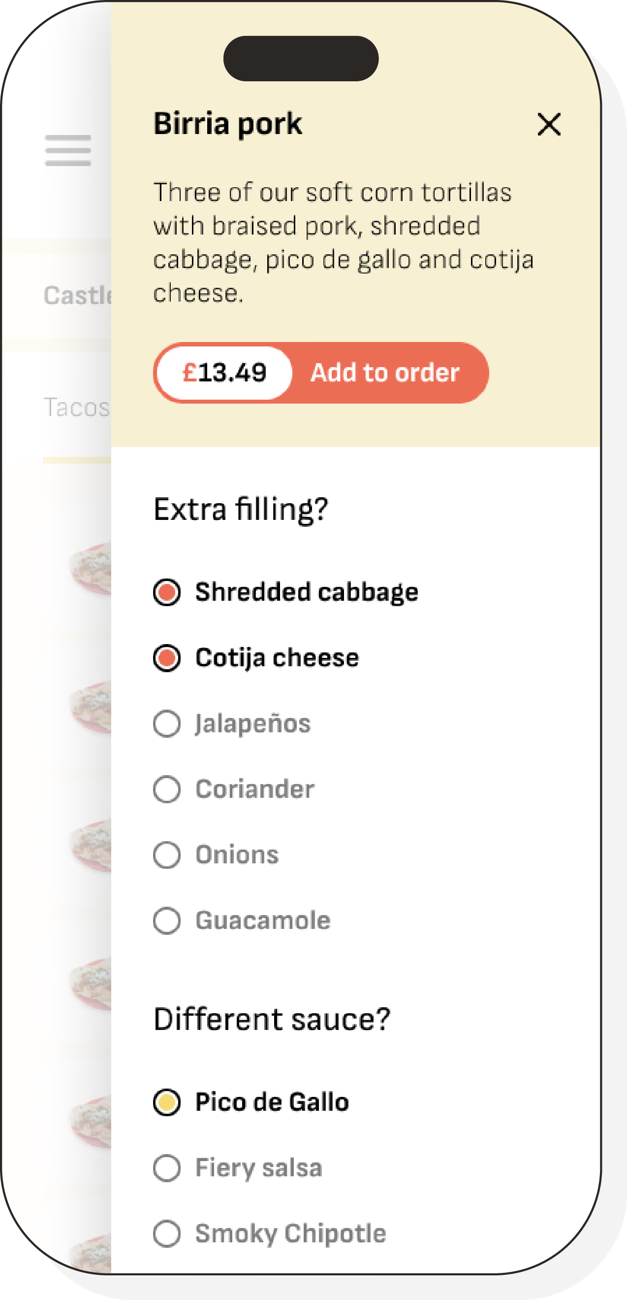
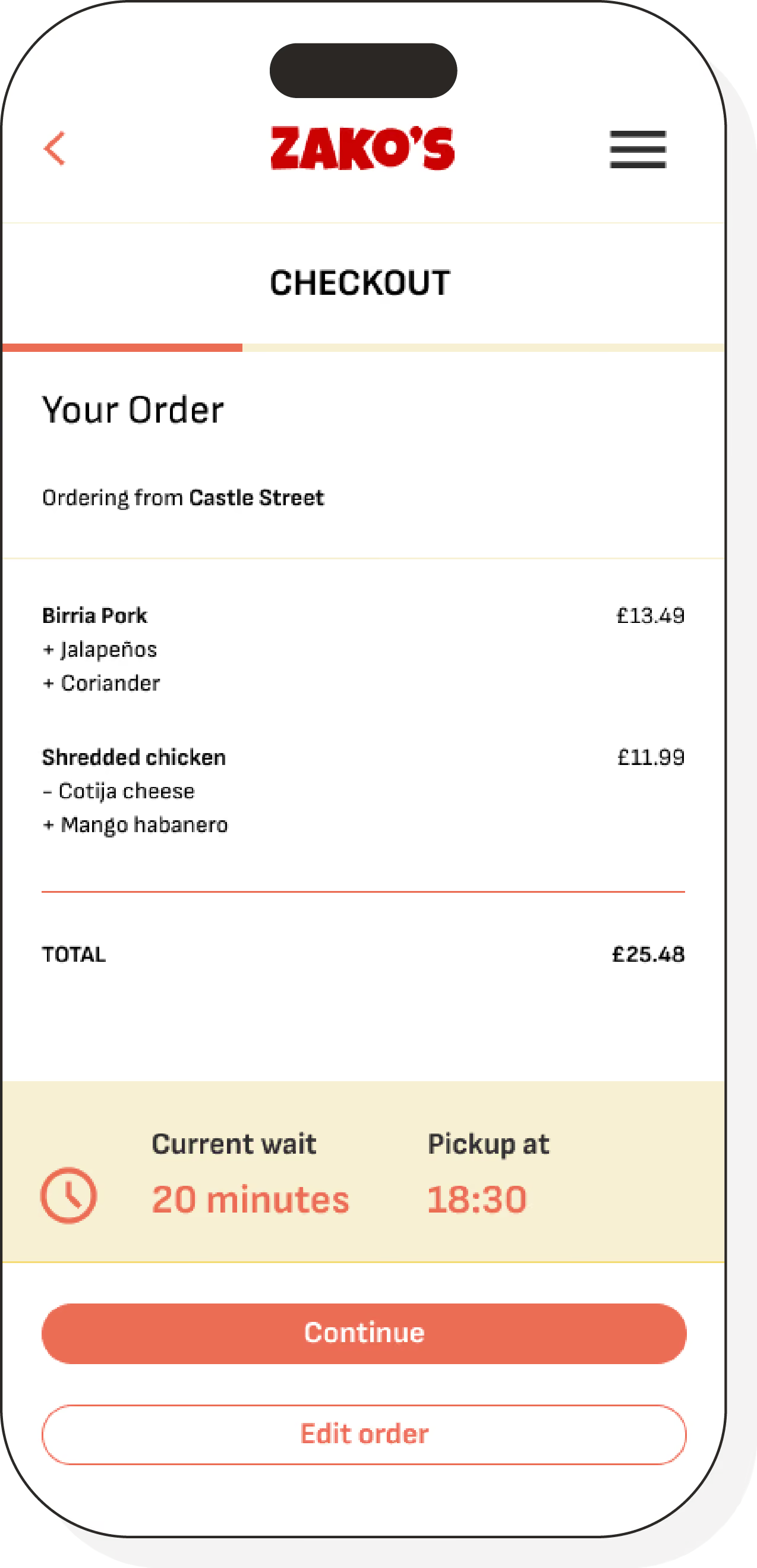
HI-FIDELITY prototype
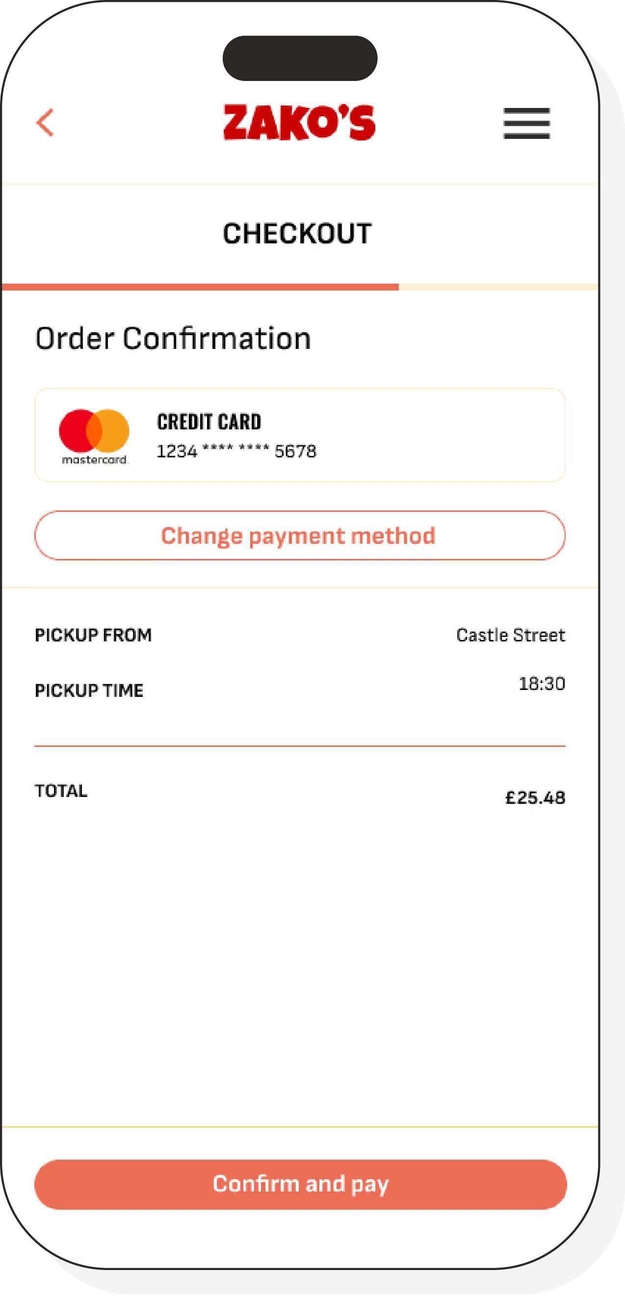
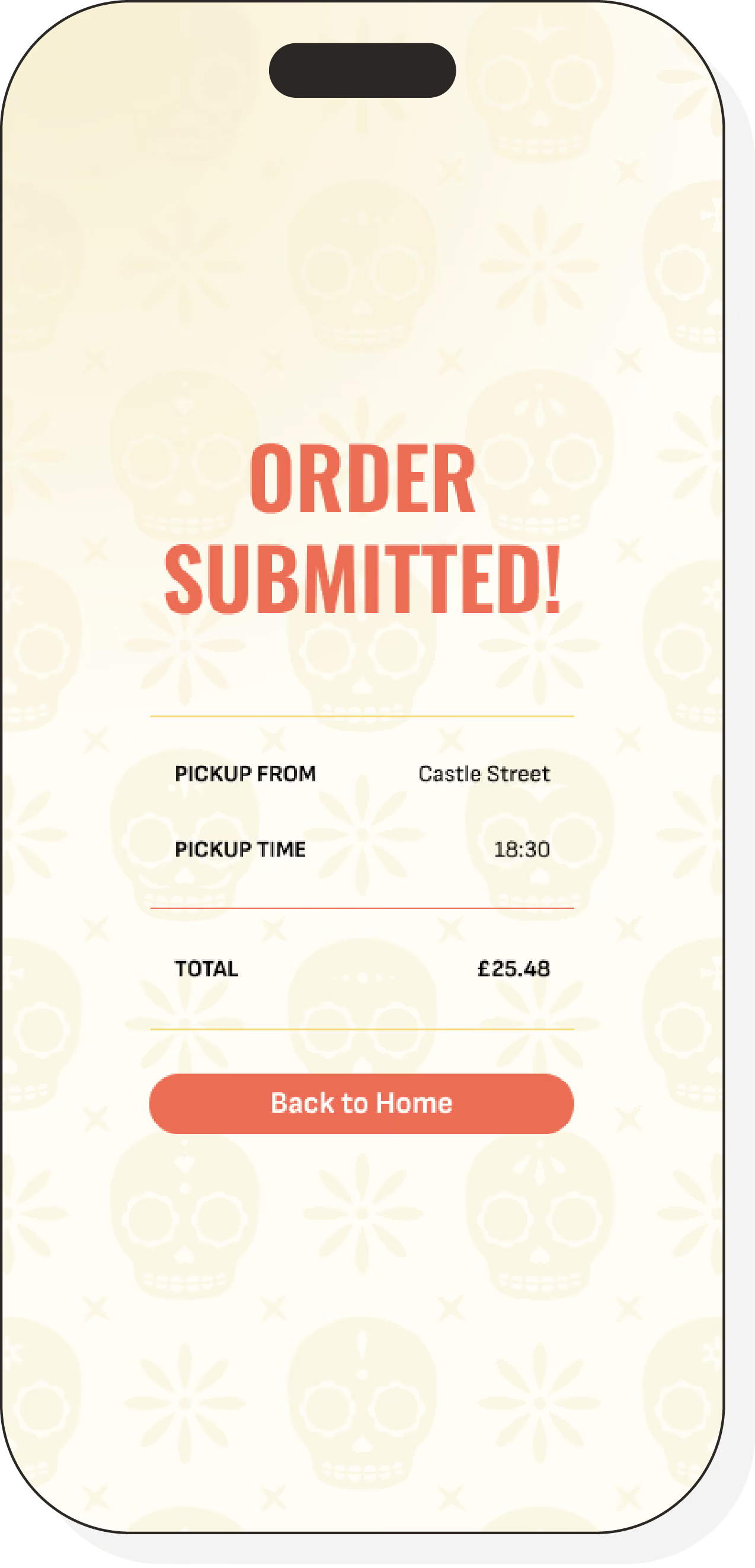
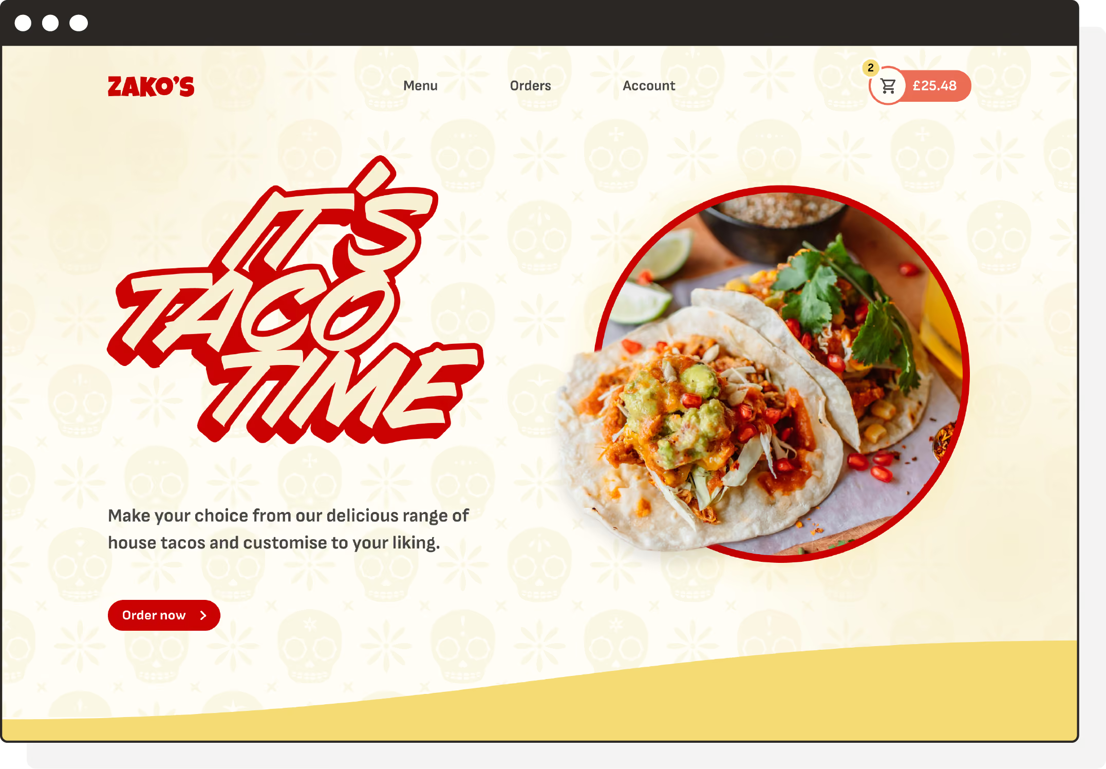
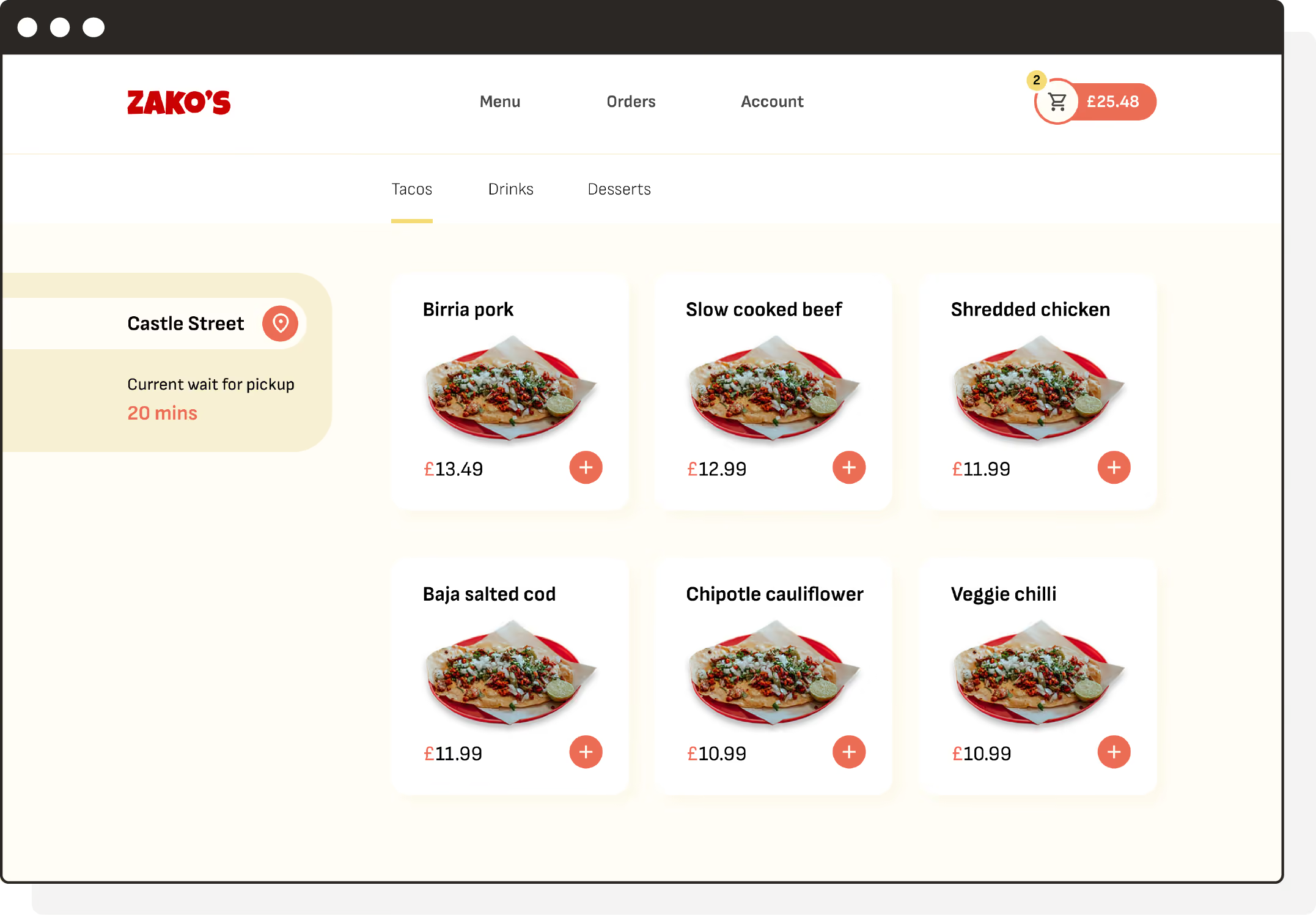
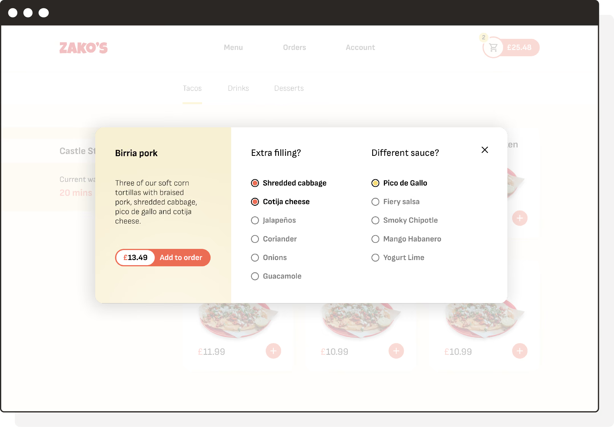
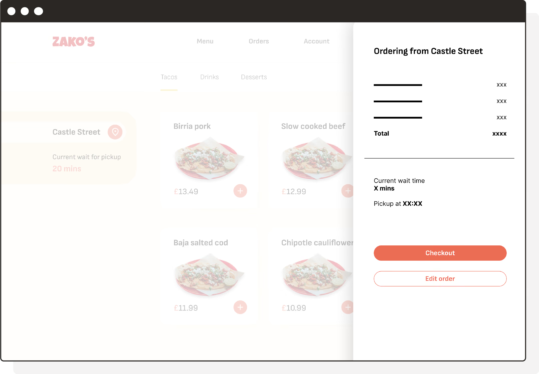
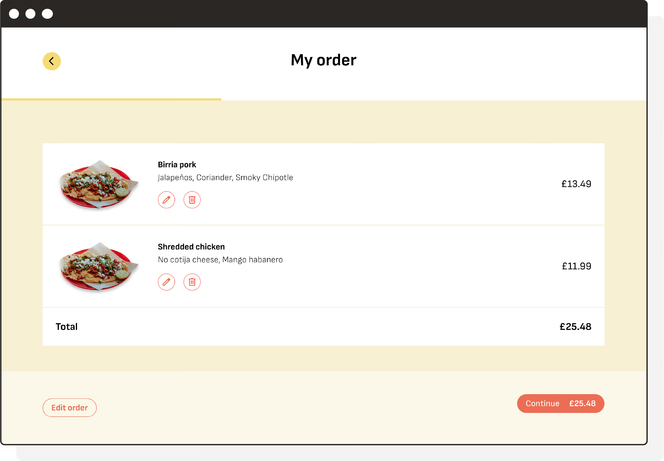
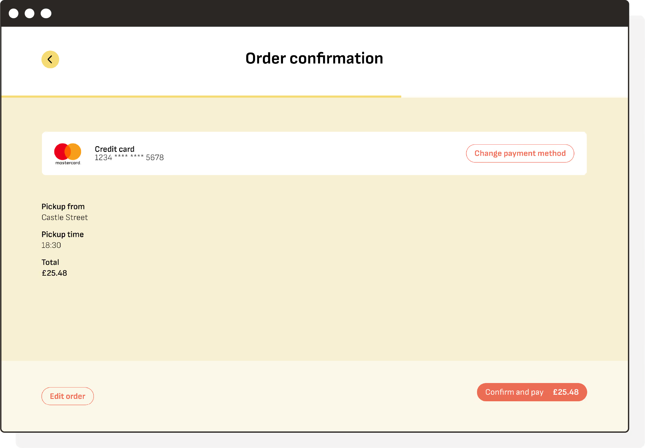
With the wireframes validated through usability testing, I moved into high fidelity, applying the visual design, colour, typography, and food photography to bring the app to life.